In this post, I’ll share with you the top 5 thoughts I took away from the day.
1. You can’t have more than three priorities
People often talk about having so many priorities, they struggle to cope. Carrie Bishop shared if you have more than three, they are simply not priorities but a wish list.
2. We can spend time creating the wrong things
Every speaker stressed the importance of understanding user needs and only making changes to improve the customer experience. What was interesting was the awareness that often we try to fix the wrong problem rather than realising some things should not be fixed. This can result in getting the wrong things really efficient, rather than making a solution the user needs.
3. There is a lot more to the digital skills gap than infrastructure and learning
Rachel Neaman shared research done by Doteveryone that demonstrated areas with great connectivity and infrastructure can still have problems with digital. The digital exclusion challenge is not one isolated issue but a complex problem including many factors including a lack of skills, cost associated with getting online, broadband issues, and a lack of time or motivation. This mix results in 23% of adults in the UK not having access to the internet.
4. Stop looking at services in sections, there is only one customer journey
We often look at service redesign in sections reflecting parts of a process or internal team structures but the user journey often relies upon many services areas including customer services, communications, digital, IT and publishing. To improve the user journey and overall customer experience, the whole process needs to be looked at through the customer’s perspective and take into consideration every part of the journey.
5. There isn’t one approach that works
After eight talks and networking with various organisations, it was clear there is not a magic formula or guide for implementing changes to digital delivery.
Open Data Day has been again! Hundreds of events with thousands of attendees happened over 6 continents – what a community of developers, hackers, data wranglers and designers there are out there: talk about the Digital Revolution! I was lucky enough to attend the London event and take part in an excellent project to do with the gender of London’s street names.
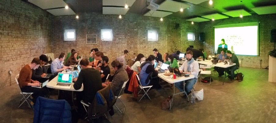
The gathering in Newspeak House, London
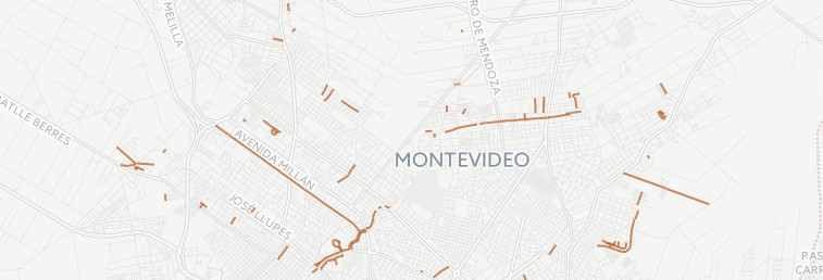
The project was all the more interesting because it was based on another project by hackers from Montevideo in Uruguay. They had collected their city’s street names from Open Data sources and then used a system called Genderize and a lot of manual curation to identify all the streets named after women. They’d then plotted this on a map on their project site, A-tu-nombre.
Streets named after women are highlighted in orange: from atunombre.uy
We decided to do the same thing for London. It was interesting to see how the same project was approached differently by us. Our assumption was that this was a project intended to highlight gender disparity and so we were concerned with plotting men Vs women on our map. However a big part of the focus in Uruguay had been to highlight the women and link to their Wikipedia page so people could learn more about them, learning about cultural history and a bit less adversarial.
Other differences became obvious in the challenge itself, for example, street naming in Montevideo often uses the full name of the person whereas in the UK we tend to use a surname or title and it’s much harder to automate the identification – this meant we didn’t bother with automated links to Wikipedia and just stuck with war of the sexes (see how that looked at the end). This is user engagement
Getting stuck in at a hackathon was a great way to build relationships with developers and Open Data users that wouldn’t normally fall into our ‘User Experience’ surveys and seminars as well as to build relationships with obvious groups like Open Knowledge. I was impressed to be working alongside local council employees and after discovering they have lots of opinions on ONS Open Data I’ll be going to visit them to hear the experience of their whole team.
Another exciting hookup was with Data Campfire who are prototyping a platform that lets data users promote their projects and link to the publishers of the data they’ve used. It’ll be so much easier to learn from our wider data users if we can get a ping from that platform whenever someone posts a new use of our data.
Perhaps the best linkup was with the original team from Uruguay who were at their own Open Data Day event and happy to give us pointers and encouragement over the course of the event. Open Data is global and it’s great to have the opportunity to engage with potential users on another continent.
For anyone that’s thinking, ‘but I don’t have the skills to go to one of these things’, I can report that it was a hugely diverse group with bloggers, designers, journalists and activists alongside the obvious programmers and data geeks. You can definitely join in and contribute at an event like this. See our project
Open Source goes hand in hand with Open Data so check out the gender assignment code over at GitHub. Or check out the CartoDB map of London’s streets with gender.
London’s streets highlighted by gender
You might notice that although it’s ‘quite good’, it’s not perfect. Long Acre is considered female for example and we had to manually intervene to stop all the lanes being genderised because Lane is a legitimate name. However, there is a reason the Open mantra is ‘release early, release often’. Rather than sit on the project until the system is perfect – many, many months from now – we can post our code and share our ideas and hopefully inspire the community straight away, just as we were inspired by the team in Uruguay.
Update: Gregor Boyd over at the Data Donkey blog has copied/extended this project for Edinburgh’s streets using a different data source and a different mapping system – check out Edinburgh streets by gender too. If you repeat/extend this project for your neighbourhood, please do comment to let us know!
World Statistics Day comes around once every 5 years and as the UK’s largest producer of official stats, it seemed only appropriate that we joined in the celebration!
There are many other Government departments who are involved with various statistical outputs so this was a good opportunity to work across the Government Statistical Service and invite our colleagues to join with us in the celebrations.
What did we do?
After some initial research, it was decided that the content would take the form of a Twitter quiz. Possible answers would take the format of Twitter gallery images, with the collapsed tweet view concealing the answers. A similar approach had been adopted previously by DFID and had drawn much interest.
Media Views and Detail Expands were top of the engagements – the more visible retweets and likes not so much. Always a good reminder not to take the performance of social content just by what you can see on the face.
Overall 5,200 engagements across stat facts and the quiz questions and a lot of positive feedback making this a successful collaboration, and thanks to all involved.
Despite these successes there are always things that we can improve on, particularly in the planning stages. Organising digital content across Government means that an effective sharing platform is needed. We were limited somewhat by network issues meaning that we couldn’t share graphics as quickly as we’d like to have done with departments, and this meant some last minute changes that couldn’t be made due to resource issues so some of the graphics weren’t as impacting as they could have been. Trello is a great platform that we are using more and more at ONS for digital projects, but relies on making boards public to people if not all parties use the tool. Any suggestions for future would be welcome!
Want to do your own quiz?
One of the main reasons for the success of the quiz was that we identified a format that had been tested by another user and used that format to build upon.
Early contact with appropriate organisations was also key – many were so prompt to respond with good suggestions in the right format, making the whole collaboration successful.
The dimensions of the graphics were just as important – keeping to the recommended size whilst also allowing for the answer positioned at the top of the graphic to be hidden effectively when appearing in a person’s timeline.
For the future?
Given the success seen in this approach, it’s definitely one we can look at again in the future. Twitter themselves have now have the option of polls.
A simple A or B option poll that lasts 24 hours has it’s limitations, but certainly a good option to trial as an alternative to the Retweet for Yes, Like for No approach that has been seen in the past.
Facebook have also introduced Q&A functionality in recent times, though the audience there is much more targeted. See our previous blog post on Digital Day and Storify detailing Retail Sales Q&A for more.
Overall, World Statistics Day was a positive day with plenty of engagement, and from a social point of view, World Statistics Day was definitely something worth celebrating!
A little while ago I blogged about our entry in to the Civil Service Innovation Challenge. Well yesterday I attended Civil Service Live in London and successfully won our semi-final against a team from BIS and then today I returned and was unsuccessful in the final. The winning team was the impressive ‘Child Abuse Image Database (CAID)‘ from the Home Office which was an impressive and important project wonderfully presented so congrats to that team and enjoy Silicon Valley!
My talk went a little haywire so here are the words I intended to say in the order I intended to say them.
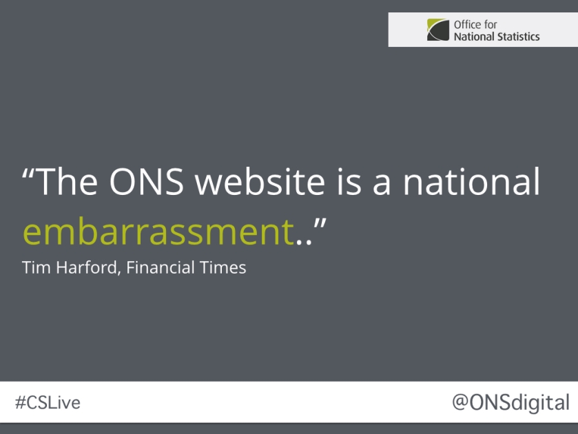
In May 2013 Tim Harford dedicated an entire column in the Financial Times to pointing out just how bad the ONS website was. He wasn’t alone – multiple media outlets and even Parliament were openly unhappy and concerned with the failures of the website.
All the criticism opened the door a crack to try something new.
According to figures in our business case open and accessible ONS statistics could be worth £19.6 million to UK Plc not to mention the importance of some of the statistics to running the economy.
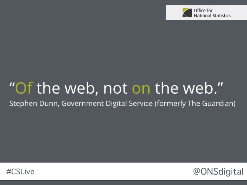
But one of the many problems with the current ONS website is that it is actually really quite difficult to find the statistics. This is because the data is often buried in Excel spreadsheets or PDFs with complex, if accurate, titles and when they are surfaced in the HTML it is unstructured and inconsistent. This is because the organisation has never really moved beyond traditional print publishing thinking – we are ON the web but we are not OF the web.
When we started thinking about what we could/should do next I kept coming back to 2 initiatives I was inspired by back in the naughties – the short-lived Open BBC catalogue and the launch of the Guardian’s OpenAPI.
What these ideas had in common was making the underlying, structured data available in machine readable formats. It wasn’t about creating a separate API for users but rather that ‘the website is the API’ and that everything else builds up from that – including your own UI – it was the embodiment of that horrible saying – ‘eating your own dog food’.
This seemed the right fit for us – the needs of our users were changing and we needed to provide a more flexible platform to support them now and in the future.
The question was how?
There was not much innovation going on elsewhere in the statistical community internationally we could learn from. So we turned to the open data community for help. To start with we worked with the Open Data Institute to prototype some ideas in code to see what might be possible. This work was invaluable and gave us a place to start but also identified some significant challenges we were going to face.
For a solution to one of those challenges we worked with data science specialists ScraperWiki to build an open source tool called DataBaker that allowed us to take all of the multitude of spreadsheets the ONS produces and transform them into something genuinely machine readable (one of the greatest fallacies is that hitting saving as CSV somehow creates something useful!)
This all leads to the JSON that underpins the whole new ONS website and is available to all users simply by appending /data to any page.
This has allowed us to provide functionality throughout the site that is customisable by users, developers, data scientists and us. Interactive charts and headline figures are auto-updated as soon as the data refreshes, we can provide feeds for all sorts of configurations of our data, our Release Calendar can be easily filtered and schedules can be subscribed to in your calendar of choice.
So how can Singularity University help us? It can inspire us to identify new uses for our data – helping us to prepare the organisation for the next generation of user needs – whether that be smart cities, machine learning, the API economy or new models of data privacy for users. It can arm us with the stories that will allow us to meet our aim of being a truly Data Intense, Design Simple organisation.
Singularity University is an interesting, and very Californian, institution. It was founded by a mix of technologists, scientists, venture capitalists and academics and now it provides a mix of courses touching on everything from nano-technology to virtual reality to bio-engineering seeking to inspire the next generation of technology leaders. A major part of the appeal of any time studying there is the constant parade of high profile guest speakers they are able to secure due to their contacts and setting at the heart of the Silicon Valley community.
I am not usually someone who goes in for entering these sort of things – awards etc for doing your work has always seemed like a slightly odd thing to me – but in this case it didn’t take much pondering to make an exception. I am very proud of the work we have been doing on the new website and the plans we have beyond that – I truly believe that providing the kind of services we are building at the scale at which we operate is innovative for Government (we clearly stand on the shoulders of some truly innovative ‘hackers’ and ‘experimenters’ though). The promise that our new site offers around the ideas of a ‘web of data’ has huge potential and hopefully can be influential more widely.
So I have thrown our hat in to the ring. If you want to read our submission I blogged about it elsewhere and fingers crossed we at least make it to the ‘semi-finals’ where we will present live to attendees at the London Civil Service Live event – which would be an experience in of its self.
South by South West Interactive takes place in Austin, Texas every March and with almost 40,000 attendees is generally regarded as the largest technology conference in the world. It invades Downtown Austin taking over the Conference Centre, hotels, offices, bars and pretty much every scrap of land it can.
It gained fame as the venue where web companies like Twitter and Foursquare really took off and every year dozens of web start-ups try to use the event as a launchpad for their products.
This year they were joined by a middle aged civil servant talking about digital transformation in government in the UK and specifically the ONS Alpha project. As you can imagine they were queuing out of the door 😉
I’ve always wanted to attend SXSWi and back in September I submitted a talk proposal based on the ONS Alpha experience to date at that time as well as some hopes for the future. To my total surprise my proposal was successful (only a very small percentage of proposals actually make the final agenda despite the houge size of the event.)
In case anybody is thinking this sounds like something of a jolly on the public purse I actually paid for it all myself and took the time as holiday (well the conference ticket was gratis but I covered the flights and hotel etc myself.)
I gave my talk to a crowd of around fifty people on the second day of the five day ‘festival’. The attendees were particularly interested in the level of user research we had undertaken and the lessons we had learned from that as well as where we saw ourselves fitting in with the wider ‘open data’ agenda. While a few people utilised the ‘law of two feet’ and one person seemed to nod off (see tweet below) it seemed to go down well and there were a number of good questions from a very diverse audience.
It was great to meet Rebecca Williams from Data.gov in the US at my talk. She asked a number of great questions and we had a good conversation when the room had cleared as well. The familiarity of the challenges faced by our cousins across the Atlantic is both reassuring and a little concerning. We are all looking to each other for the answers but for now at least nobody really has it completely covered.
Rebecca recommended I meet Jeff Meisel, the Presidential Innovation Fellow based at the US Census Bureau and after a little Twitter stalking I was able to pick his brains for a couple of hours over a beer. Jeff and his team are focusing on improving the provision of APIs for Census data and making it more attractive for reuse by developers. They have been particularly inspired by the CitySDK work that started in Europe and again I found the similarities of our challenges reassuring. Jeff is also proposing that the Census Bureau invest in their own ‘digital services’ team that would operate in a very similar manner to the team I am lucky enough to be building here. There is much the teams will be able to learn from each other and I’m hoping we can share experiences, research and, eventually, code.
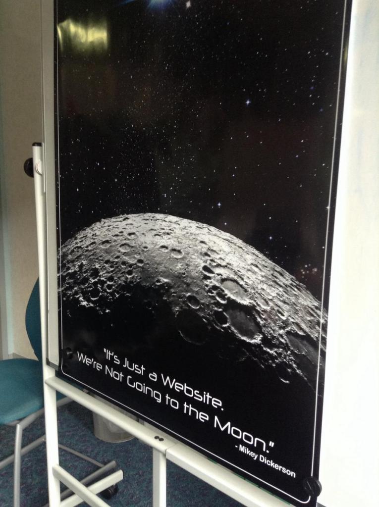
Elsewhere I also attended a talk from Jen Pahlka, Executive Director of Code for America and Mikey Dickerson, who leads the new US Digital Service. Their two-handed talk was a passionate advert for the need for digital capable people to join in and help ‘fix’ Government IT/digital. They had some compelling examples and were honest about how it was a potential disaster, the Healthcare.gov problems, that really provided the impetus to get so much change happening in Washington and beyond. Mikey Dickerson is something of a cult hero in my team as he is the man behind this quote;
I attended a few more vaguely work related sessions but if I’m honest got most excited by a sighting of Hulk Hogan and have to say all in all it was a very strange experience. Then I suppose Austin is very proud of being weird.
I can be a little bit sceptical about conferences; perhaps I’m scarred from years of attending statistically focussed events where half the talks can be discussing very niche problems that I struggle to relate to. I think I’ve found the conference for me.
Alan wrote late last week about his quick reflections on the Graphical Web conference that many of us from the ONS Digital team attended. He’d be too modest to say but a huge part of the conferences’ success has been down to his personal efforts in the run-up and behind the scenes. Many of us from the ONS Digital Content team came away enthused, full of inspiration, re-energised…but at the same time a little bit knackered.
On a personal level it was great to meet so many enthusiastic and like-minded people. It was also inspiring to meet many of my data visualisation idols, hear their thoughts, and draw on their insight. I’m using this post to briefly reflect on just a few of the talks that really resonated with our work in the ONS Digital team.
Amanda Farnsworth gave a keynote on the experiences of leading the BBC’s visual journalism team. One of the BBCs values is that the “audience is at the heart of everything they do” and it was good to see that this was recognised through a project ‘the secret life of cats’ involving Cats and the Internet – everyone loves this combination! What was even more fabulous to hear was the importance the BBC puts on working with experts. Their approach is a two-way street:
They keep their ears close to the ground and take interest in academic projects that that might engage the BBC’s audience. They then approach these projects and if possible they will collaborate with the experts so that the BBC build on the projects knowledge and convey their stories in an engaging way.
The BBC also has its own ideas and if relevant they will contact experts to involve them in their projects. They then collaborate to make sure that the methodology and conclusions are correct, as well as drawing on any ideas they may have. The Great British Class calculator was an example of this.
There are strong parallels with the work that we undertake within ONS. I gave a talk at the conference (and last month I wrote a blogpost on Rich Interactive Storytelling) that looked exactly at this combination of drawing together the expert knowledge of our statisticians/economists/researchers to produce rich, but simple to use interfaces to understand and explore our data.
The BBC’s Secret life of the cat
The other message I came away with from this talk with was that it’s OK to experiment in public. All too often in ONS we get trapped in a culture of everything has to be perfect before it can be released. We know that as a government organisation we need to be careful about how our content comes across to our users but within that it’s possible to experiment with new content forms and ideas. There are two caveats though – 1) the content should still be professional, drawing on the knowledge and skills you already have in your organisation, and 2) Is that you should set aside time to learn from the experimentation. The BBC marks their experimental content very obviously and invites comments from their users.
Scott is an Assistant Professor of Design at the Univeristy of San Francisco. I first became aware of Scott through his fantastic book, “An introduction to d3js” – it’s been one of our team’s bibles over the past years as we’ve been building skills. It’s available at all good bookshops…and Amazon. One of my colleagues, the very talented Zoe Hartland, even felt compelled enough to give Scott a hug for the help it’s given her – but this wasn’t why he was at this conference.
Scott’s keynote presentation was a philosophical look at the keys to a successful design process. It’s been written here before about how the various digital content teams are being brought together from across ONS, our data visualisation centre, design and editorial teams. This is a really exciting time; bringing the different skill sets together from across these teams should lead to better content – the tricky bit will be understanding how to bring these skills together in a design process. So I watched with interest. What was the key to a successful design process? Scott’s response was “IT DEPENDS”?!! In all seriousness though it does depend – the lesson was that your design process needs to be flexible depending on what skills, resource, goals, time, tools, budget etc that you have available.
Expertise needed for data design
The talk did cover other visualisation experts attempts at defining and illustrating a design process – a lot of these covered common elements that we already do within our work, but this collection of thoughts will be useful when we more formally discuss how we go about working together. It’s not a finished topic for Scott, he’s keen to gather the experience of more data visualisation people through this survey.
Part of the conferences’ brilliance was that it combined the standard setters and implementers, as well as those who practice and use the technology as part of their work. Doug works for W3C, the organisation that curates the standards for the web. His talk was about making graphics and visualisations accessible.
It’s well established that using visualisation can really help get messages across in a way that text and tables can’t. But what if you’re visually impaired? What would be your experience on the web? This is how Doug began his talk – he used a screen reader rather than his own voice that hit home that whilst it was easy for the screen reader to read the text and tables it wasn’t able to process a chart embedded as a simple image.
We care a lot about accessibility in our work. It’s important that we make our work accessible wherever possible, particularly as a government organisation, servants of the public. A lot of the topics he covered we were well versed in, they form part of a course we deliver on the basics of data visualisation – elements like colour, the right chart choices etc, but Doug’s presentation went beyond this and offered some very practical solutions to improve the accessibility experience in native web content, such as adding screen-readable labels to bars on a bar chart. My favourite was a line-chart example, where as you ‘played’ the chart from left to right the a constant sound would change it’s pitch to match the height of line. We’re considering composing some charts – “Sweet Child of Mine” in chart form anyone?
Invisible Visualisation – A chart that plays a sound as you move left to right
In summary, it was a brilliant conference and I haven’t even mentioned the workshops. The videos for the talks are gradually being processed and edited by the fantastic Winchester Journalism School team. The majority of the conference talks will be available on the conference website, and I’ll add the talks I’ve mentioned here as they become available.
Over the last few days, ONS Digital staff have been busy running The Graphical Web 2014: Visual Storytelling at the University of Winchester. I wrote briefly before the event about my pre-conference expectations and reasons for hosting – here’s some follow-up thoughts about how the event itself unfolded.
Firstly, the numbers. We had 165 delegates from 15 countries as far away as the USA, Australia, Japan and Mexico – which genuinely gave it a global feel. Over 4 days, the conference had 5 keynotes, 2 panel sessions and 3 parallel presentation tracks, together with 8 workshops. Size-wise, I thought this worked out well, because it was small enough to feel intimate but large enough for there to be a buzz about what was going on in other tracks etc. Luckily, our superb volunteer team from the Winchester School of Journalism have captured the vast majority of the content with multi-camera feeds, so delegates (and in fact, everyone) will be able to revisit their favourite talks and see the ones they didn’t manage to make it to: We’ll post the video, along with links to presentation slides on the conference website shortly. By way of a visual scrapbook, we’ve also created a conference flickr steam.
For many delegates, these kind of events are a great way to network with luminaries who they may previously only have known via Twitter – for example, Scott Murray, Lynn Cherny, Robert Kosara, Jaume Sanchez Elias all travelled a long way to Winchester and I know there are a lot of people happy that they did so.
Personal highlights included Cameron Beccario’s amazing and inspirational keynote talk about how he created The Wind Map. As well as being an amazing site, the story behind its development, together with Cameron’s humorous and modest delivery made it a standout talk. Mass spontaneous applause half way through your presentation is usually a good indicator that you’ve done something special…
Jason Davies’ Geometric Madness was jaw-dropping in its complexity. Most delegates appreciated the subtle humour of Jason describing some of the work he presented as ‘quite difficult’ to create – the viral rumour that the GeoJSON file format was named in his honour deserves to spread…
The BBC Visual Journalism team led by Amanda Farnsworth also deserve special mention for contributing so much – a keynote, 2 workshops and a panellist was a great effort. A memorable finale to the last keynote from Amanda was ‘close-up’ footage of a cat vomiting as part of the Malofiej-gold-winning ‘Secret Life of Cats‘ interactive. That being said, the program was full of so many truly amazing talks that I am sure delegates will go home with many memories.
One persistent theme for comments throughout out the conference was that the wide ranging audience of web standards/implementors/web programmers/data viz/statistics/journalist – types made for some genuinely interesting discussions both during and inbetween sessions. People had enough in common to find things to talk about, and sufficient differences to generate lots of well-mannered debate/arguments. We’ll aim to post some more follow-up articles focussing on specific thoughts and reflections from some of the talks – there were far too many gems to cover them all in this short post.
The social event also worked well – I’m thankful to the delegates from the Met Office for arranging for the rain to stop and the sun to shine long enough for us to sail around Portsmouth Harbour and see HMS Illustrious being decommissioned, before settling for drinks and dinner on ‘HTML’ Warrior.
Finally, there are so many people to say thank you to for helping us to make the event a success that I can only be brief here: The volunteers at Winchester led by John Wilson, along with the Winchester conference team, my geographically-distributed colleagues on the main conference organising committee, our many sponsors and supporters (including W3C), Portsmouth Historic Dockyard, ONS Digital staff, the presenters, keynotes and workshop instructors. Sally Oatley at ONS deserves special mention for organising disorganised people (me) and taking a firm line with coach companies who phone up an hour before the social event with news that one of their coaches had broken down. Phew, it takes a lot of collective goodwill to make these kind of events work.
But that’s enough from me – I’d be interested in hearing more feedback from delegates, either via Twitter (#tgw2014) or as a response to this post. Please share your thoughts as it will help us to make next year’s event even better! For 2015, the conference heads across the North Atlantic to Pittsburgh, PA. , in the safe hands of Dr David Dailey and his colleagues from Slippery Rock University. If you want to be a part of the organising committee, contact the conference team info[at]graphicalweb[dot]org . Otherwise, follow the build up on http://www.graphicalweb.org – and see you there!
I spent Thursday evening and all day Friday attending Wikimania 2014 at the Barbican in London. For the uninitiated Wikimania is the annual conference for the Wikimedia community (that is Wikipedia and all its sister projects.) Like the Olympics or the World Cup the event takes place in a different country/city each time and there is a comprehensive bidding and voting process to select the successful proposal. It is considered quite an honour for the successful ‘chapter’ and Wikimedia UK have certainly made the most of the opportunity. Next year the conference is in Mexico City so I doubt my ‘travel & subsidence’ budget will stretch to that 🙂
I was invited to say a few words at a small fringe event on the Thursday evening alongside the CEOs of both Wikimedia UK and Creative Commons which was an unexpected honour. I spoke about the work ONS is doing to open up our data and also our burgeoning relationship with Wikimedia UK. It seemed to go down well with the crowd and spurred some interesting conversations that I need to follow up.
Friday afternoon I had been accepted to give a talk in the main programme about the work ONS has been doing to contribute to Wikipedia and to talk a little about some personal ambitions for future collaborations – not just from the ONS but the wider official statistics community. I was especially interested to talk to those in the know about Wikidata, a project that was something of a hot topic at this conference.
Despite a focus that I considered would probably be of niche interest around 100 people attended the talk and it spurred a lively Q and A session that I greatly enjoyed and left me with more ideas and inspiration than I quite know what to do with. I had particularly interesting conversations with attendees from Google, the Metropolitan Police, Wikimedia South Africa and the e-Government Institute in Switzerland. It was a nerve-wracking experience as they were a knowledgeable audience who asked many insightful, hard questions but I am very glad I did it.
The rest of my day was focused on attending sessions on the ‘Featured Speaker’ track. The event organisers had put together an all-star list of speakers from the ‘open data’ community and more widely.
Nigel Shadbolt, co-founder of the Open Data Institute, started the day with his talk about ‘social machines’. It was a different focus than I expected from a man I most closely associate with the ‘semantic web’ and the harder end of ‘web science’. I’m a big fan of Zooniverse, having even briefly worked with the team on a project, and was interested to listen to him weave a narrative around the power of computing + people to solve problems that computing alone could not resolve where Zooniverse was held up as an exemplar.
The next two speakers were Lydia Pintscher, the Product Manager of the Wikidata project, and then Markus Krotzsch, who is one of the technical founders of the project, which as I mentioned earlier was the hot topic on the day. It was referenced in almost every talk or conversation I was involved in.
Wikidata is a fascinating project that is seeking to create an open, query-able, machine readable, database of verifiable ‘facts’ that can be integrated with any Wikimedia project and beyond. This create some incredible opportunities and the Wikidata team have already created some impressive demos (the Siri like answer engine being a particular crowd pleaser.) For more of an idea of what is possible take a look at the Reasonator or for a very visual view of the potential power of the database check out Histropedia which has some very fun possibilities. Between Lydia and Markus I came away with a much better understanding of what they are trying to build I think and why it is potentially so important.
Viktor Mayer-Schonberger, from the Oxford Internet Institute, gave a talk about the power and possibilities of ‘big data’. It was pretty much a whistle stop tour of the big issues for ‘big data’ and what we can, could, should and shouldn’t do with it. It is a topic I find hard to really get a handle on – the data science needed to really comprehend it at any really useful level is beyond me and without that you are left with buzzwords and the same couple of success stories time and again (impressive though they are).
After a break from the sessions for my own moment in the spotlight I returned to the main room to listen to Mike Bracken talk about the work of the Government Digital Service. Mike is the Executive Director for Digital at the Cabinet Office and while it was a talk I knew well it is always useful for me to hear – the work of GDS is the standard we all need to live up to in digital Government projects these days. It was telling I think that Mike was the only person in the main plenary track to take questions direct from the audience – and the questions were far from soft balls. GDS talk a lot about being open and it is impressive to see the man at the top practice what they preach.
Photograph by Mike Peel (www.mikepeel.net)
Mike was followed by Rufus Pollock, founder of ‘Open Knowledge’, who gave a thoughtful talk using shipping and shipping containers as a metaphor for open data – particular the discoverability and reuse of it. The talk was a triumph of staying true to your metaphor of choice and I was particularly pleased it worked towards a pitch for the use of ‘data packages’ which we’ve already started to experiment a little with as a lightweight way of providing our data.
The final talk of the day (for me) was from Peter Murray-Rust, a ‘reader’ of molecular chemistry at Cambridge University and advocate for open science, open access and, as he said in his talk, pretty much open everything! Amongst other things Peter can lay a strong claim on coining the term ‘open data’. He certainly created the entry for the term on Wikipedia. He led the campaign against the use of PDF in scientific publications because of the lack of machine readable data included and has been working on a new tool, ContentMine, that uses data mining techniques to make sense of the huge number of impenetrable publications out there and provide researchers with actionable data. The tool can even make sense of those PDFs now – including the ability to retroactively take PDF’d tables and turn them back to CSV.
It was Peter who used this term of ‘digital age of enlightenment’ with the flair only a well practiced public speaker can make. He was talking about how the power of things like Wikipedia to make knowledge freely available to huge amounts of people should be embraced by all – including scientists as this was an opportunity to change the world.
Inspiring stuff and appropriate for what was an inspiring day all around. Sadly I was unable to stay for the rest of the conference but based on Friday alone I can say it was a huge success and the team behind it at Wikimedia UK deserve congratulations on a job well done. It is the community that makes these things work though and again I was amazed by the generosity and passion of the open community. Keep up the good work.
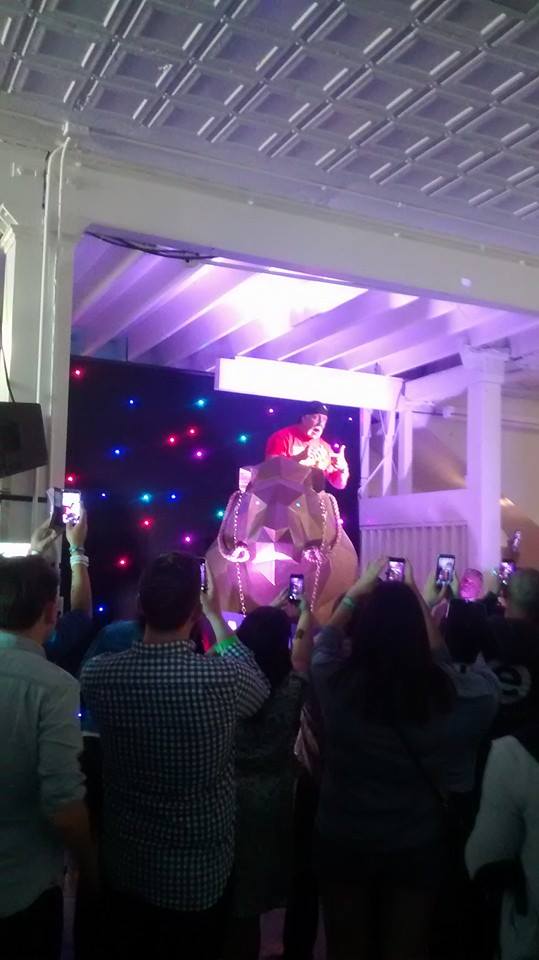
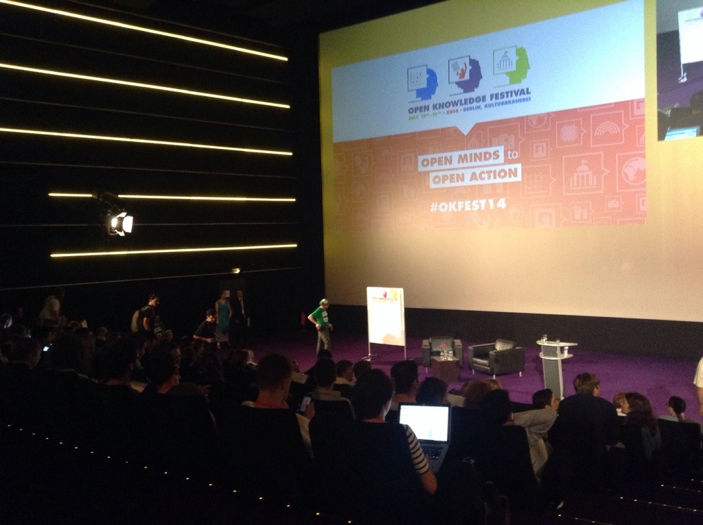
The last couple of days Laura (the boss) and I have been attending the Open Knowledge Festival in beautiful Berlin.
The event is the main community outing for the organisation formerly known as the Open Knowledge Foundation and has upwards of 1000 attendees from approximately 60 countries talking about the whole spectrum of ‘open’ – education, access, source, government, data and beyond.
The ‘Festival’ prides itself on being very different to a traditional conference – even the venue selected reinforces this with sessions taking place scattered across a ‘cultural quarter’ with talks taking place in performance spaces, bars (with disco balls proudly spinning) and a cinema. There was even a graffiti wall yesterday with political motivated artists giving lessons.
The enclosed courtyard layout and lovely weather has also created a perfect area for adhoc meetings with friends old and new. You cannot fail to bump in to someone interesting and helpful with this many talented and passionate people in close proximity.
As ever it has been these chance meetings that have been the highlight for me – discussions about participating at Wikimania, learning more about Wikidata, a discussion about supporting Govcamp Cymru, being talked through the goals of the .Dat project (initially pitched as Github for data) by its founder, being praised on behalf of Alan and his team about the ONS population pyramids from somebody at the World Bank, chatting about OpenAddresses with Jeni Tennison and meeting (albeit briefly) some of the guys behind Development Seed/Mapbox from DC whose work I’ve been following and been inspired by the last year or so (and as I sit here writing this I’ve just bumped in to someone from DFID long followed on Twitter but never met!).
Apart from perhaps the similar Mozilla Festival I doubt there is anywhere else where this level of serendipity is possible for those of us with an interest in these open topics (for the record my main interest here has been open data but in years gone by I have been associated with open education, open access and open source!)
The opening keynotes each day have also been incredibly interesting and have set the theme for the event. There has been a constant underlying tone that while open data is great it is time to get beyond just worrying about release and start making things happen. Whether that is about becoming less naive in dealings with Governments and their representatives, or building wider ecosystems for open data rather than the next shiny app the call has been clear – it is time for the community to take the next step in its evolution and start delivering the impact it promises.
The first keynote on Wednesday was a real treat. Patrick Alley from Global Witness gave a quick tour through the incredibly fascinating and brave work his organisation does in trying to bring the economic abuses of corrupt governments and organisations to light. He presented a mix of risky in person investigations, open data and whistle blowers, lobbying and policy making all working together to perform incredibly important tasks. It was the sort of talk that both inspires and makes you question your own career choices!
The other keynote that particularly resonated with me was from Eric Hysen, who leads the civic and elections team at Google. Eric had a tough task following EU Commissioner Neelie Kroes who gave a well received speech (she got a standing ovation) and also there was a decent portion of the audience for whom Google is fast becoming the boogie man.
His talk nicely tied up the themes that had been emerging at the event though – particularly on the more practical side. He spoke about the need to get past the rush to release data and the need for data to be release in structured formats and to consider the issues of interoperability and standardisation.
His metaphor about the need to build better roads rather than more cool stage coaches was interesting and seemed to make sense especially when talking about ecosystems and collaborations and the fact that nobody, not even the mighty Google, can do it all on their own and we all need to work together to build the infrastructure and the standards to allow this work to really make an impact.
All in all with just the journey home to come, which will provide more time to reflect, I would like to thank the organisers (and volunteers) for putting together a fun, interesting and inspiring event.